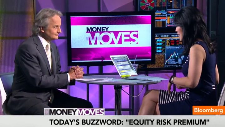
Q. So this is a classic measure that tells us how much return investors demand to invest in stocks instead of less risky assets…
A. Right. You start with a so-called “risk free” rate, represented by government bonds (maybe a debatable proposition, but for another day) and you’d say, OK, if I can earn that much without any risk, what kind of returns do I have to expect before I’ll switch over and invest in the stock market instead? That number is the “equity risk premium”.
Q. So… I guess the premium goes down when people are feeling good, and up when they start getting nervous…
A. Right, you can see that in this chart. In the sixties, people didn’t demand much of premium — maybe around 3% — because stocks were so stable; and at the height of the tech bubble, just 2%, because they were so excited by the potential returns. But in the recent crisis, you can see the premium got very high… nearly 7%. But the average over time is around 4%.
Q. So is the implication that stock values have room to run here, since this chart shows we’re still above the historic average?
A. Many folks argue that, and some guys from the NY Fed have just published a paper on that point. But as is true with a lot of “historical” financial averages these days, the Fed’s QE has thrown a monkey wrench into the analysis.
Q. And why is that?
A. Many folks think that its also important to look at the history regarding the total expected return on stocks: that is, the risk free rate plus the ERP. The average for that number is around 8 or 9%. Today, its just in the 7s. But if interest rates keep rising, of course, we’ll be right back at– or maybe even above– the historic average. And so by that measure, stocks are not cheap here.


